Agency & Studio · by giulialeccadesign
STUDIO MOROSO
 giulialeccadesign
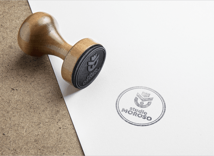
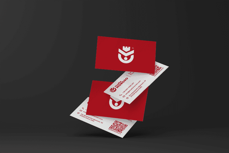
For Studio Moroso, a historic studio based in Soave, I developed a new visual identity designed to enhance the studio’s heritage while clearly communicating its core values. The logo is built on an essential yet meaningful construction: • the client at the center, represented by the central dot; • care and professional support, expressed through the curved line that embraces it; • focus and direction, suggested by the directional sign that guides the viewer’s eye; • history and strong ties to the territory, evoked by a shape inspired by the battlements of the Castle of Soave. The color palette revolves around Pantone Space Cherry red (#990011), chosen to convey solidity, authority, and a strong sense of identity. The visual system is complemented by the Quasimoda typeface, characterized by clean and elegant lines that provide balance, readability, and a contemporary aesthetic. The result is a visual identity that blends tradition and modernity, designed to present the studio in a coherent, recognizable, and professional way. Project by Giulia Lecca




Voting is closed for this nominee.
Votes (0)
No votes yet — be the first.