Other · by mariyam
Oaten
 mariyam
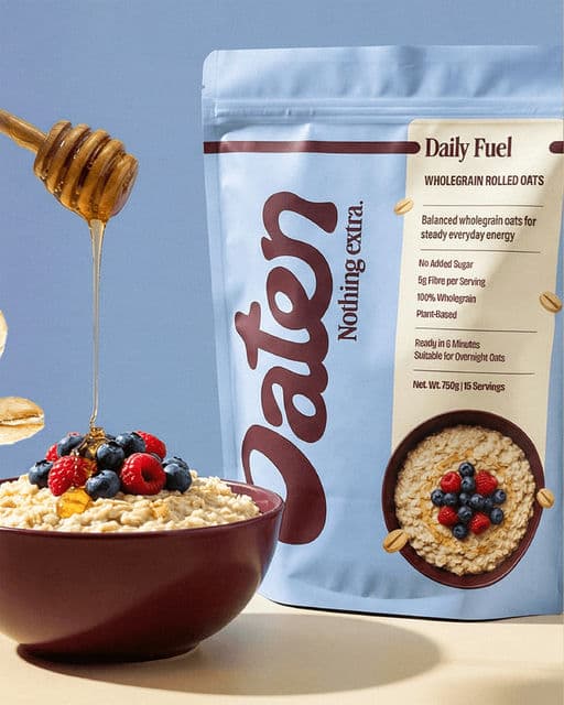
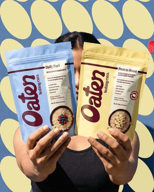
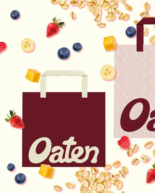
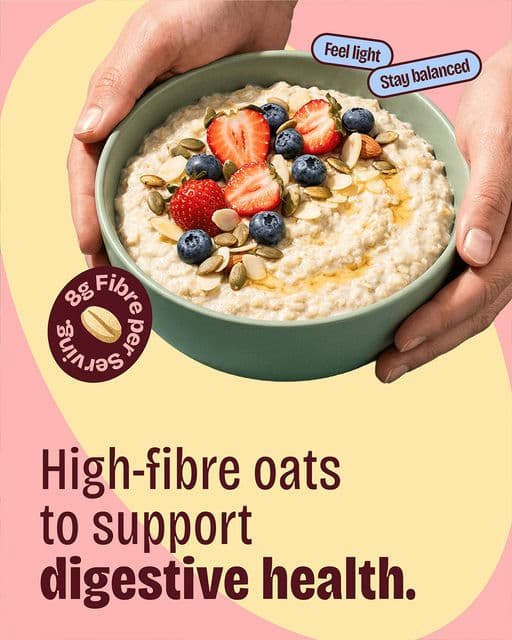
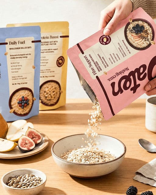
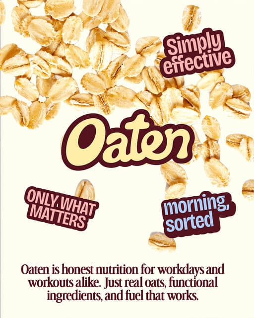
Oaten is a modern oats brand designed around clarity, functionality, and honest nutrition. The brand focuses on simple ingredients and purposeful benefits, creating a breakfast option that fits naturally into the routines of working professionals who care about their health. The visual identity is built to feel warm, structured, and trustworthy, reflecting the idea of everyday fuel done right. The product range is organized into three clear variants — Daily Fuel, Protein Boost, and Fibre Support — each addressing different nutritional needs while maintaining a cohesive brand system. Through thoughtful color coding, clean typography, and minimal yet confident packaging, Oaten aims to bring clarity and intention to the breakfast aisle while presenting oats as a modern, functional staple.

Voting is closed for this nominee.
Votes (0)
No votes yet — be the first.


