Voting closed
Link copied
Food & Beverage · by zenobia-designs
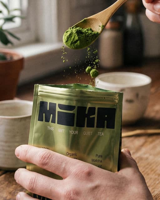
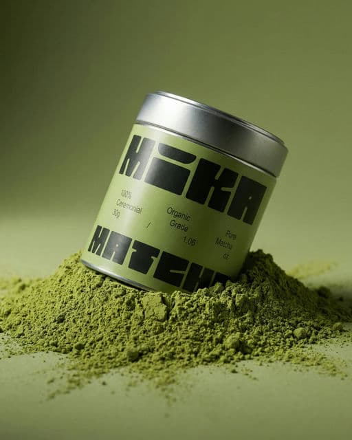
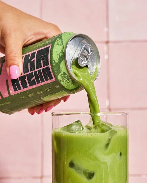
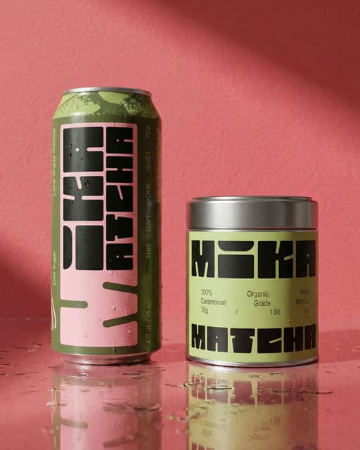
Mika Matcha
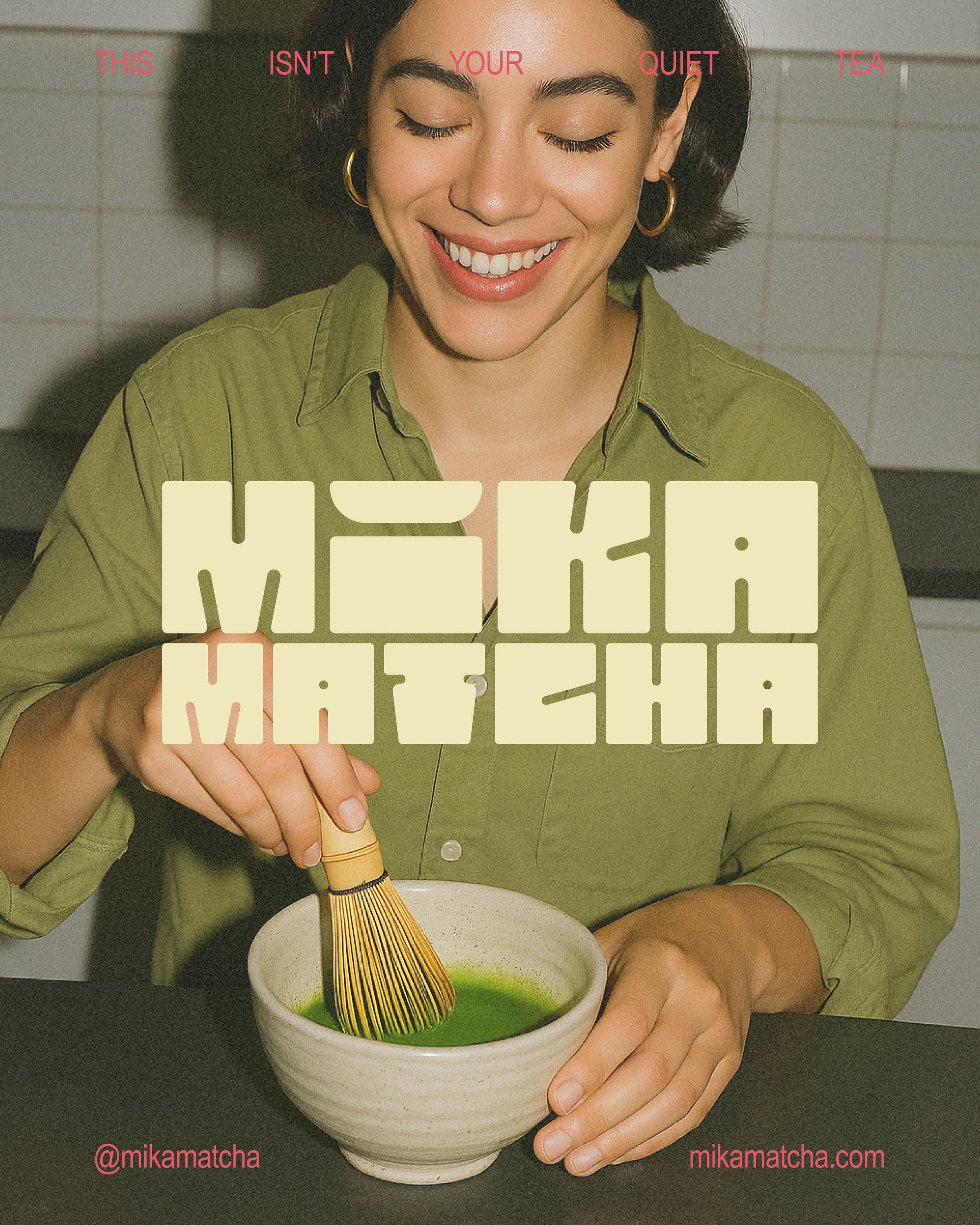
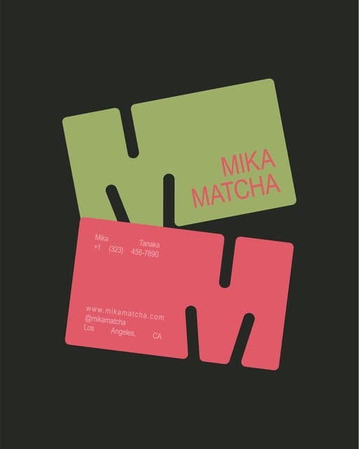
The concept was designed to feel vibrant and bold. To support this energy, the custom typography was carefully built by hand in Illustrator, giving the brand a distinct and confident presence. Alongside this bold foundation, the concept introduces a softer layer through vintage tones. While the brand is energetic at its core, these elements add a sense of timelessness and organic character. They help ground the identity and subtly communicate quality and authenticity, making the brand feel more thoughtful, and rooted in story other than just bold expression.



Voting is closed for this nominee.
Votes (0)
No votes yet — be the first.