Home & Living · by lanab
Lumea
 lanab
lanab
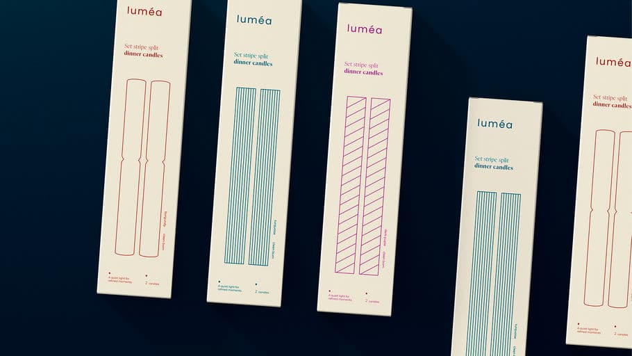
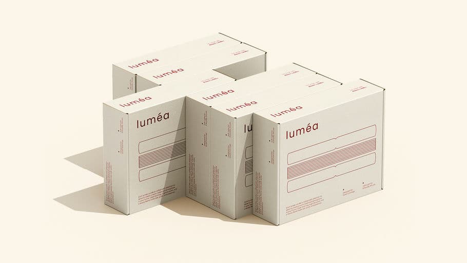
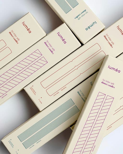
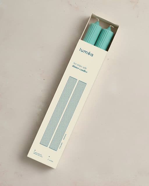
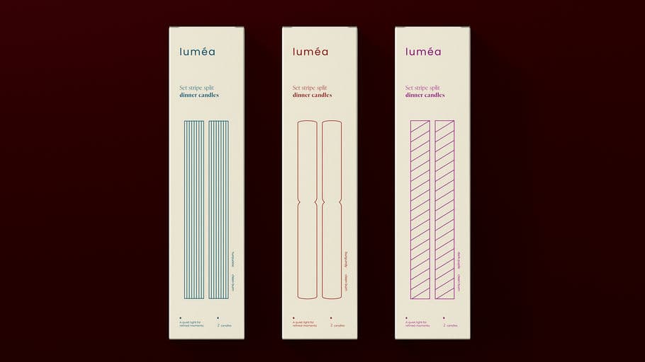
Identity | Packaging design Lumea The name Lumea draws from the idea of light and glow, without being literal. Soft and balanced, it sets the tone for a brand that feels warm, modern, and composed. The logo is intentionally minimal. Set in lowercase typography with generous spacing, it communicates confidence without excess. There are no decorative elements - only clean forms designed to feel contemporary yet enduring. The brand identity is built around repetition, rhythm, and structure. Linear patterns and stripe variations form a visual system inspired by the steady burn of candlelight. These elements create consistency while allowing variation across products. Color is used with restraint - muted reds, violets, and teals provide distinction without breaking the brand’s quiet tone. The packaging design reflects the same philosophy. Tall, slim boxes echo the proportions of the dinner candles inside. The layout prioritizes white space, allowing the product to feel light and refined. Fine line illustrations suggest the form and pattern of the candles without relying on photography, reinforcing a sense of calm and intentional design.



Voting is closed for this nominee.
Score
Votes (0)
No votes yet — be the first.