Beauty & Personal Care · by madebynoop
LIFE LAB
 madebynoop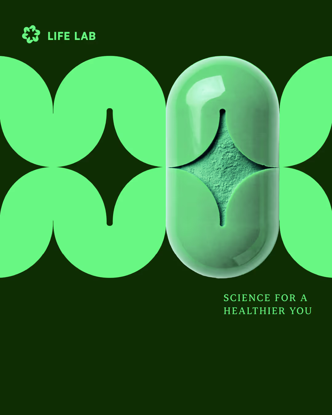
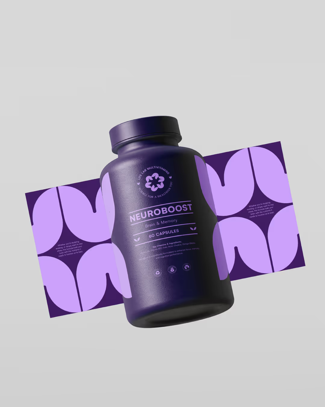
LIFE LAB is a multivitamin brand built on three essential pillars: health, life, and science. The branding process focused on visually uniting these elements into a strong, memorable identity that balances scientific credibility with natural vitality. The packaging design embraces bold typography, organic geometric shapes, and contrasting hues, creating a vibrant yet structured visual language. Each product features a unique color palette with both dark and light tones, representing different formulations while maintaining brand consistency. The LIFE LAB logo is a fusion of three meaningful symbols: The Star of Life – Representing health and well-being. A Flower – Symbolizing growth and vitality. A Capsule – Reflecting the scientific foundation of the brand. Together, they create a dynamic emblem that conveys trust, innovation, and holistic wellness. From the outset, the goal was to craft an identity that feels scientifically advanced yet approachable. The interplay between organic shapes and structured layouts reflects the balance between nature and innovation—a core principle of LIFE LAB. This branding system creates a sense of movement and transformation, aligning with the brand’s mission to support an active, evolving lifestyle.




Voting is closed for this nominee.
Score
Votes (0)
No votes yet — be the first.