Food & Beverage · by adamstav-graphics
GINO TRATTORIA
 adamstav-graphics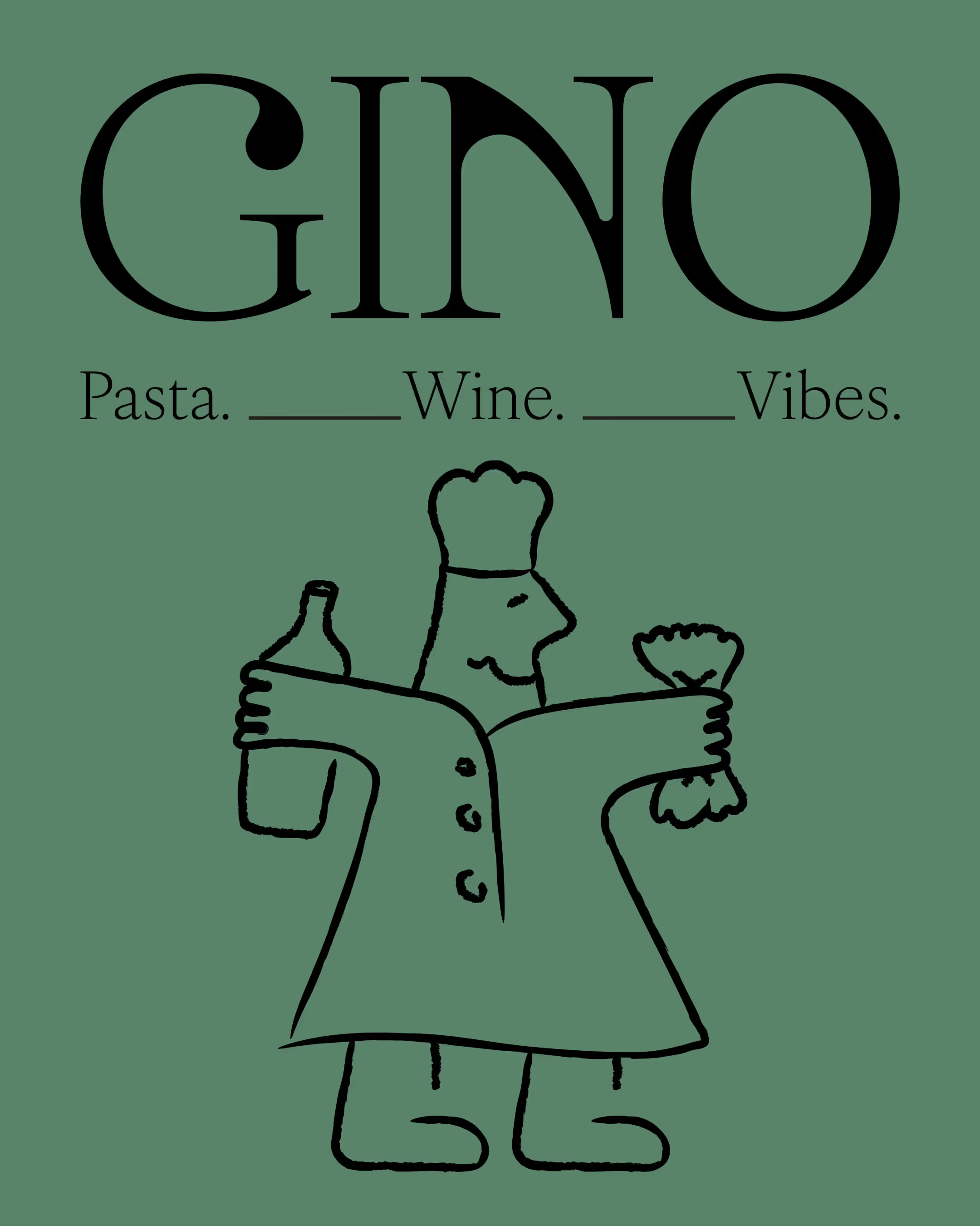
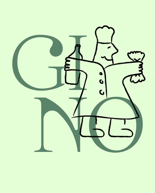
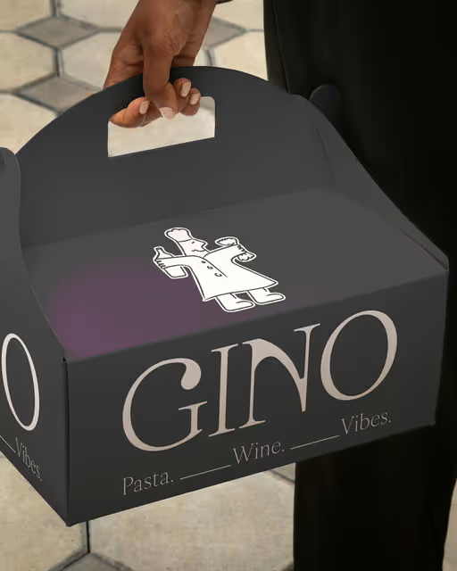
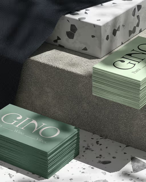
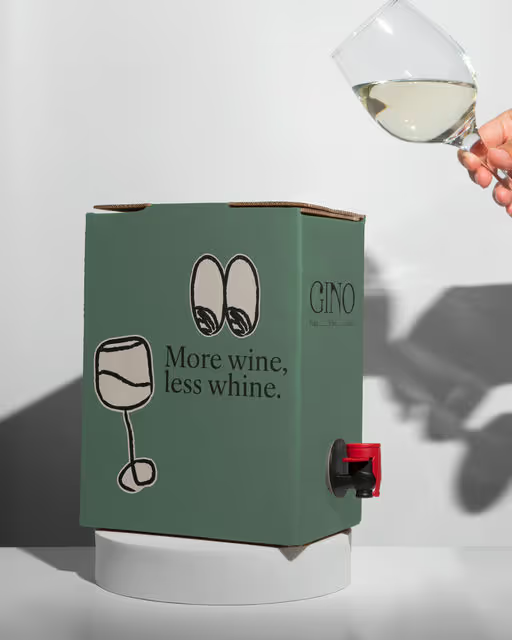
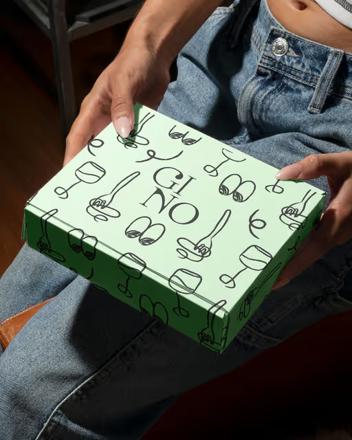
For Gino Trattoria, I aimed for a brand identity that feels like a warm, lively Italian restaurant in a modern way. The goal was to mix fun, authentic Italian charm, and a simple, memorable style. The logotype is bold and clean, its contemporary lines subtly incorporate a classic elegance in their curves and weight. The heart and true differentiator of this brand is the custom-illustrated character, "Gino" the chef. The way he playfully holds a bottle of wine and some pasta instantly communicate the core offerings with a warmth that's universally appealing. The hand-drawn, slightly imperfect style feels genuine and invites connection. Gino tells a story without words. He's the host, the provider of good food and drink. This distinctiveness creates an emotional anchor, making Gino Trattoria sticky in the minds of customers.



Voting is closed for this nominee.
Votes (0)
No votes yet — be the first.