Braaands™ is back! New platform, now with voting • Braaands™ is back! New platform, now with voting • Braaands™ is back! New platform, now with voting • Braaands™ is back! New platform, now with voting • Braaands™ is back! New platform, now with voting • Braaands™ is back! New platform, now with voting • Braaands™ is back! New platform, now with voting • Braaands™ is back! New platform, now with voting
Braaands™
Voting closedBOTD
Link copied

Food & Beverage · by brands-by-chavi

Brand Identity - Pasta di Nonna 🍝

brands-by-chavibrands-by-chavi
Brand Identity - Pasta di Nonna 🍝

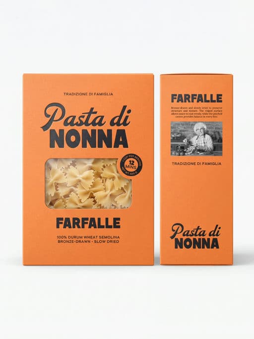
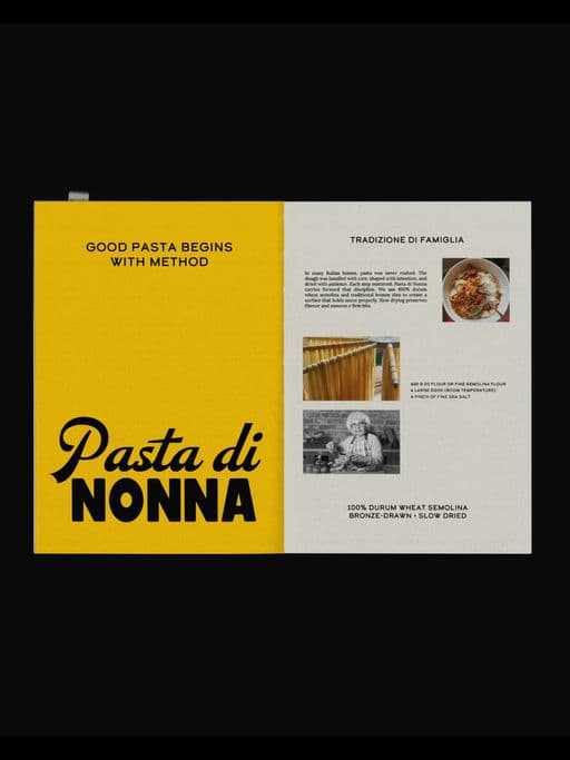
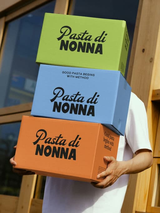
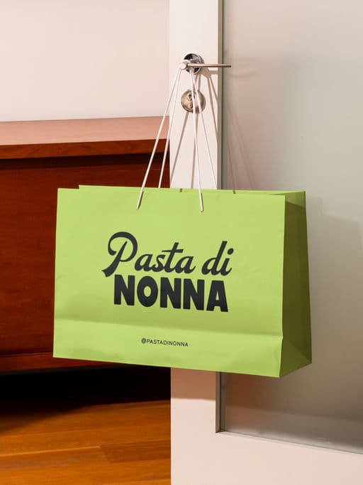
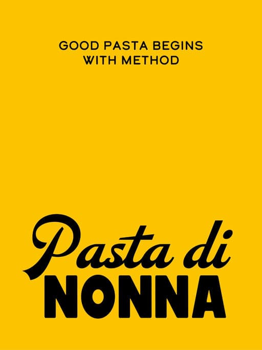
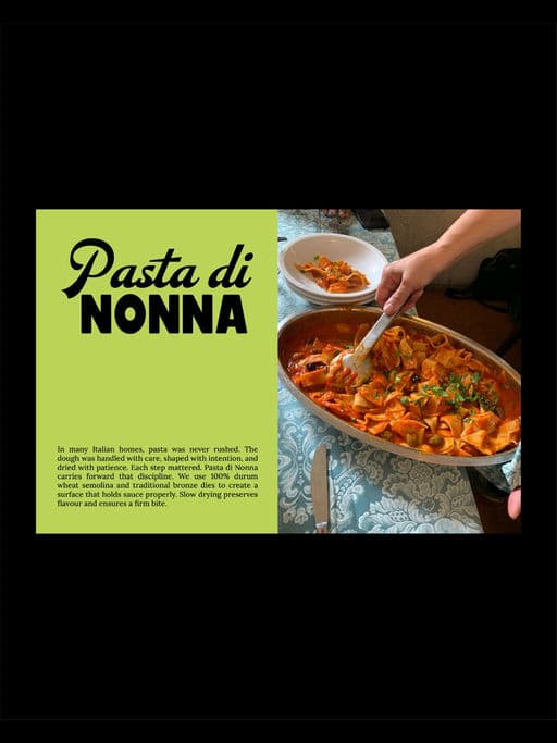
Pasta di Nonna is a heritage pasta brand that draws from traditional milling and slow drying techniques. I wanted the packaging to feel simple, confident, and honest. The clear window lets the product speak for itself, the typography creates a strong and easy reading flow, and the colors help it stand out on shelf without trying too hard. Good pasta begins with method. Good packaging begins with intention.

Brand Identity - Pasta di Nonna 🍝

Voting is closed for this nominee.

Score

Votes (0)

No votes yet — be the first.
More like this